Rikreay
Based on her Cambodian background, Christina Yip created a new business within the food industry. The name she chose for her brand is “Rikreay”, which means “Happy” in the Khmer language.
Client
Rikreay (Chile)
Commission
Christina Yip (Chile)
Scope of Work
Logo Design
Identity Guidelines
Year
2021
In Detail
Christina Yip is a woman of Asian origin currently living in Santiago, Chile. In 2021 she created a new business in food production, starting with homemade food to take away, made by herself with the distinctive Cambodian flavor inherited from her family. The brand she is building has plans to expand in the future.
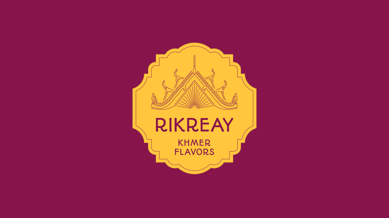
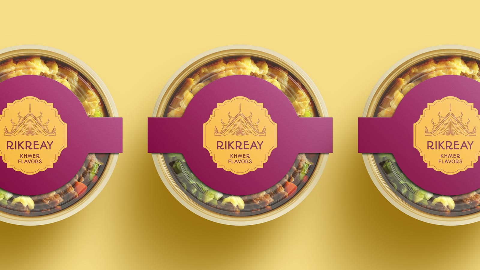
The logo design for her project combines Christina’s origin, represented by a roof of Khmer architecture, with feminine, rounded typography to express her unique personality, all enclosed in a shape that resembles a seal to highlight the excellent quality of her gastronomic creations. The warm colors selected for the logo reinforce the concepts of “happiness” with yellow and “feminine” with violet, referring again to Christina’s joyful and caring spirit.
One of the expansions envisioned for the brand in the long term is to open a bubble drink shop. Hence, the logo has a variation where the descriptive text changes to fit this business branch. At the end of the project, the Client received a complete identity guideline to safely apply her logo while matching different needs, budgets, and materials.


What the Client said
The first time I contacted Lai, I had no idea how my logo should be. She was very friendly, explained to me everything I need to know and guided me throughout my project. She completed my new logo with my full satisfaction, the result is amazing!